Scope of work
• Logo • Color Palette • Typography • Digital • Print
Client
Learnup LLC
Industry
Business Services
Design Focus
Logo
Visual Identity
Duration
2 Weeks


The Backstory
The Backstory
The Backstory
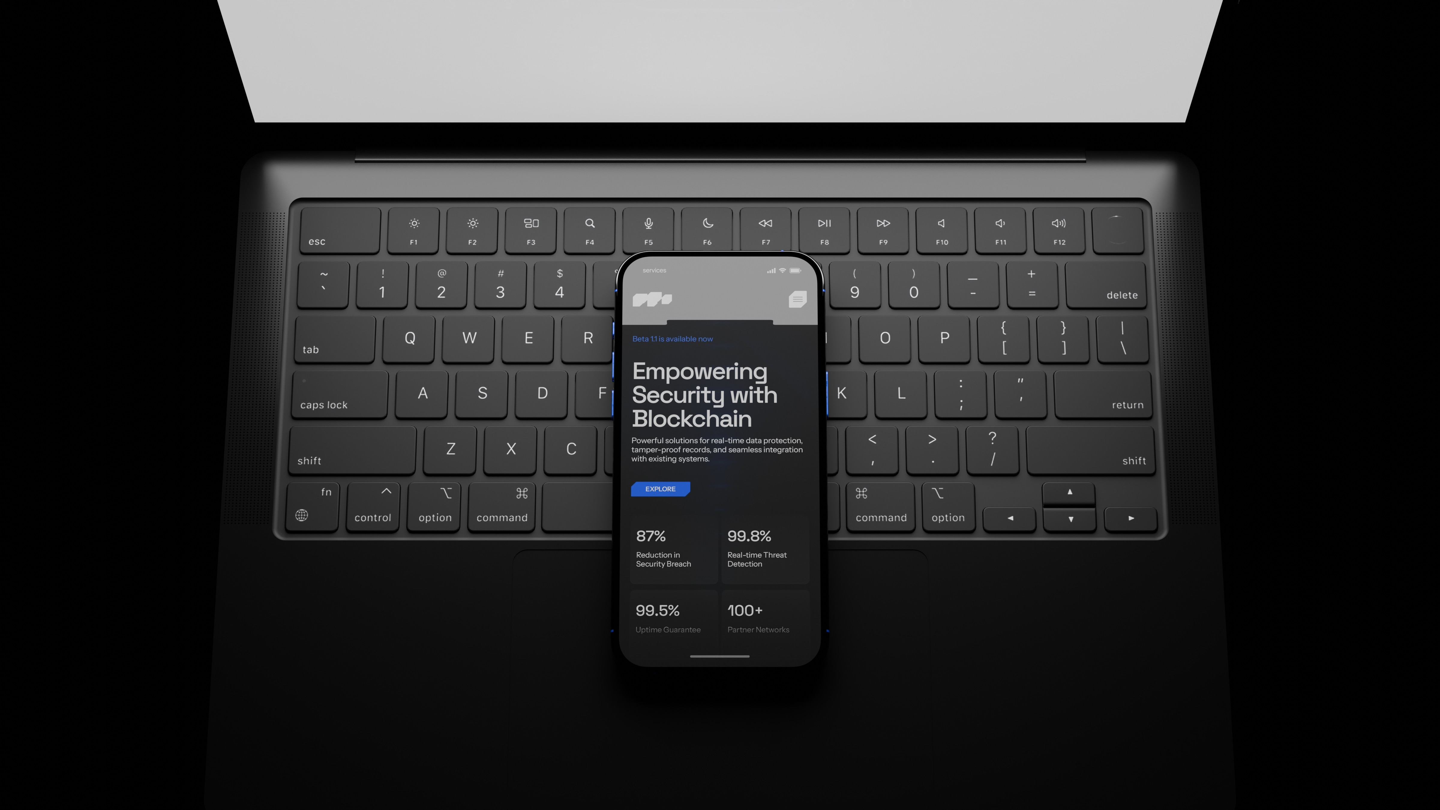
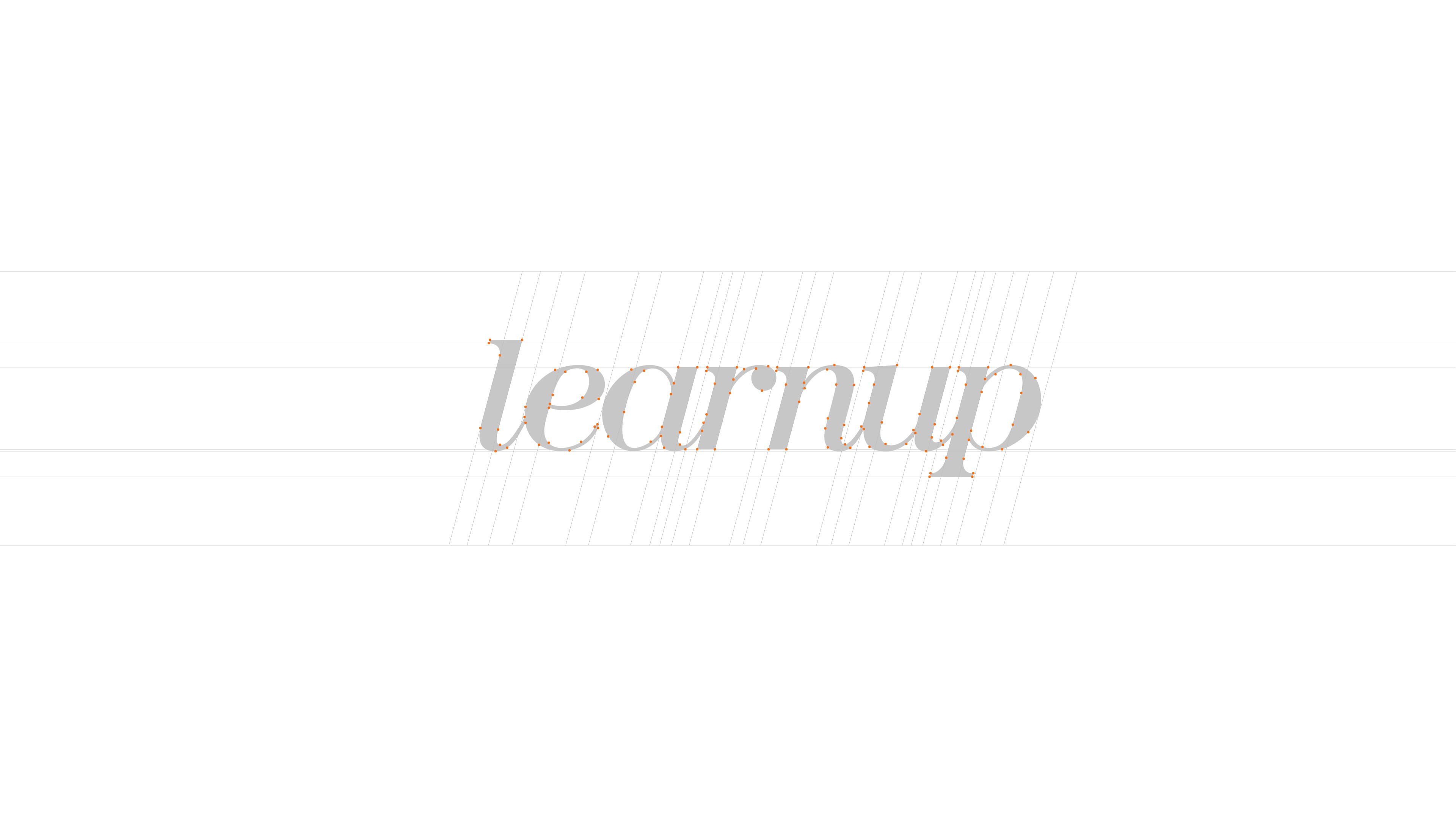
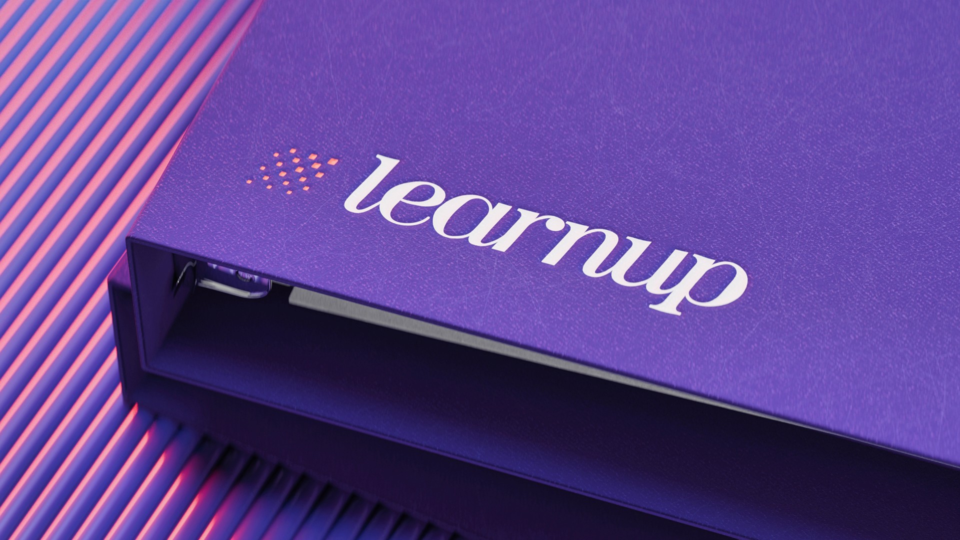
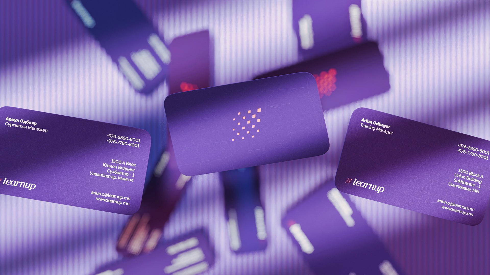
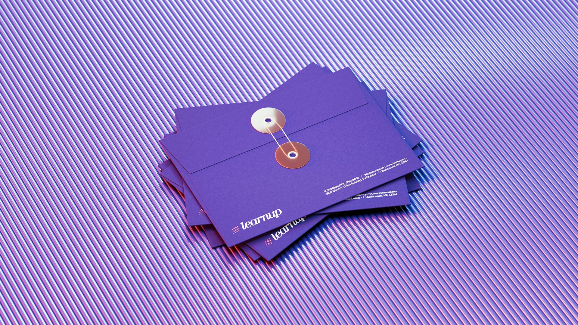
Learnup, a growing company in the HR development sector, recognized the need for a refreshed brand identity. The existing logo had become outdated, and the client wanted a simpler yet recognizable design to align with their evolving focus on employee development and workforce preparation for recent graduates. They also decided to remove the tagline, as the brand was already well-established among its customers. The goal was to create a brand identity that reflected Learnup’s values of professionalism, growth, and excellence while ensuring a cohesive and modern visual presence. A complete overhaul was required to unify the brand's message across various materials. The redesign began with a new logo that embodied Learnup’s dynamic and professional ethos. The new design symbolized growth and innovation while maintaining a clean, modern look. The tagline was removed for a more streamlined identity, and a fresh color palette was introduced to enhance adaptability across different applications.
Learnup, a growing company in the HR development sector, recognized the need for a refreshed brand identity. The existing logo had become outdated, and the client wanted a simpler yet recognizable design to align with their evolving focus on employee development and workforce preparation for recent graduates. They also decided to remove the tagline, as the brand was already well-established among its customers. The goal was to create a brand identity that reflected Learnup’s values of professionalism, growth, and excellence while ensuring a cohesive and modern visual presence. A complete overhaul was required to unify the brand's message across various materials. The redesign began with a new logo that embodied Learnup’s dynamic and professional ethos. The new design symbolized growth and innovation while maintaining a clean, modern look. The tagline was removed for a more streamlined identity, and a fresh color palette was introduced to enhance adaptability across different applications.